Replication of
Spatial, temporal and content analysis of Twitter data
Original study by Wang, Z., X. Ye, and M. H. Tsou. 2016. Spatial, temporal, and content analysis of Twitter for wildfire hazards. Natural Hazards 83 (1):523–540. DOI:10.1007/s11069-016-2329-6,
&
First replication study by Holler, J. 2021 (in preparation). Hurricane Dorian vs Sharpie Pen: an empirical test of social amplification of risk on social media.
Replication Author: Vincent Falardeau
Replication Materials Available at: https://github.com/vinfalardeau/RE-Dorian
Created: 11 May 2021
Revised: 23 May 2021
Abstract
Wang et al (2016) analyzed Twitter data for wildfires in California, finding that the social media data reflect increased situational awareness on the part of local people during hazardous weather events. Wang et al also examined trends (key words and word clusters) in the content of wildfire-related tweets, identified moments when tweets peaked, and charted a retweet network. The spatial distribution of Twitter activity can reveal to what degree the activity’s geography concurs with the geography of real-world events, like the wildfires in California. Spatial Twitter data can also be linked to populations (of cities, counties, etc) to see just who is affected and how they are responding.
Holler (2021) is studying Twitter data for Hurricane Dorian on the Atlantic coast, finding that in spite of tending news and social media content regarding a false narrative of risk, original Tweets still clustered significantly along the real hurricane track, and only along the hurricane track.
Reproducing and replicating spatial research with respect to the overlap of social media and hazardous weather continues to be relevant because people often turn to online platforms to share status updates during natural disasters, to check and share local news, and to comment on emerging situations. There are important ethical questions around privacy and the use of geo-tagged social media content; at the same time, such content can also be used to pinpoint places and people in need of aid. As people become more aware of privacy concerns & social media platforms are kept a little bit more honest, geo-located social media data might become more rare – already, the proportion of tweets with spatial information is under 5 percent. Even so, the sheer volume is great enough that spatial research can provide meaningful results, and will continue to do so well into the future.
In this replication study, I turn from the wildfires of California and the track of Hurricane Dorian to Tornado Alley, conducting another spatial, temporal, and content analysis for tweets between April 27th and May 4th, 2021 containing the keyword ‘tornado.’ Over the course of those eight days, there were several tornadoes between EF-1 (moderate damage) and EF-3 (severe damage) on the Enhanced Fujita scale, located primarily in the South and the Great Plains.
Original Study Information
Wang et al (2016) studied Twitter content related to the Bernardo and Cocos/San Marcos wildfires, within a 40-mile radius around San Diego and during a ten-day period from May 13 to May 22, 2014. Their analysis was primarily descriptive, focusing on the where, when, and what of wildfire tweets (hence the title, “Spatial, Temporal, and Content Analysis…”). Wang et al mapped the spatial density of tweets relative to population using dual kernel density estimation (dual KDE), they charted tweets over time for each fire (Bernardo peaked on the 14th, San Marcos on the 15th), they graphed what words and topics were coming up the most frequently, and they diagrammed who was being retweeted the most.
Holler (2021) loosely replicated the methods of Wang et al (2016) for the case of Hurricane Dorian’s landfall on the U.S. mainland during the 2019 Atlantic Hurricane season. Data was based on Twitter Search API queries for tweets (excluding retweets) within a 1000-mile search radius encompassing the eastern half of the US.
Holler modified Wang et al’s methods by not searching for retweets for network analysis, focusing instead on original Tweet content with keywords hurricane, Dorian, or sharpiegate (a trending hashtag referring to the storm). Holler modified the methodology for normalizing tweet data by creating a normalized Tweet difference index and extended the methodology to test for spatial clustering with the local Getis-Ord statistic. The study tested a hypothesis that false narratives of hurricane risk promulgated at the highest levels of the United States government would significantly distort the geographic distribution of Twitter activity related to the hurricane and its impacts, finding that original Twitter data still clustered only in the affected areas of the Atlantic coast in spite of false narratives about risk of a westward track through Alabama.
Wang et al (2016) conducted their study using the tm and igraph packages in R 3.1.2. While it is somewhat unclear what GIS software Wang et al used for spatial analysis, the balance of evidence suggests ArcGIS – the maps give credit to Esri, among other sources.
The replication study by Holler (2021) used R, including the rtweet, rehydratoR, igraph, sf, and spdep packages for analysis. My replication closely follows the methods used by Holler (2021) in R, applying the same packages and code to a different subject.
Materials and Procedure
My analysis of Twitter content about tornadoes began with a very basic search for all tweets containing the text string ‘tornado’ within a 1000 mile radius around Little Rock, AR. This search returned 37,295 tweets, so I then searched for a control/baseline set of 37,295 tweets in the same area, related to any topic whatsoever. For this replication I excluded retweets, unlike Wang et al, in order to have a more uniquely differentiated set of tweets.
tornadoes <- search_tweets("tornado",
                           n=200000, include_rts=FALSE,
                           token=twitter_token,
                           geocode="34.75,-92.29,1000mi",
                           retryonratelimit=TRUE)

baseline <- search_tweets("",
                           n=37295, include_rts=FALSE,
                           token=twitter_token,
                           geocode="34.75,-92.29,1000mi",
                           retryonratelimit=TRUE)
The complete search results for these tornado and baseline tweets can be recovered from lists of the status_id for every tweet, available here: tornadoesids.txt, and baselineids.txt. After processing to only select tweets with spatial information (either latitude/longitude coordinates or a city/neighborhood/poi location), there are fewer tweets than are included in these raw files – 2,274 tornado tweets and 2,139 baseline tweets.
Later in the analysis, we normalize tweets by county-level population data, obtained from the tidycensus api in R. Here is a link to these census data, after they have been filtered to the states of interest: Census Data.
The methods for this replication study can be summarized in about nine steps. For further detail, refer to the code in the github repository.
- Chart tweets by hour to reveal when people were tweeting about tornadoes (Figure 1).
- Compile a full list of all the words in the tweets, remove uninteresting words, and count the frequencies of each word (Figure 2).
- Pair words that occur together in tweets, count how many times they occur together, and graph a network of word pairs that occur 150 or more times (Figure 3).
- Spatially join counties to tornado tweets & to baseline tweets.
- Count tornado and baseline tweets by county, and normalize into rates per population.
- Calculate the “Normalized Difference Tweet Index,” (tornado rate - baseline rate)/(tornado rate + baseline rate), and make a map showing higher and lower prevalence of tornado-related Twitter content relative to the baseline (Figure 4).
- Convert county polygons to points, and identify which county centroids are within 110 kilometers of one another.
- Calculate the Getis-Ord G* statistic to identify hot spots and cold spots.
- Classify the G* scores to identify which ones are statistically significant at the p<0.10 or p<0.05 level, and map the result (Figure 5).
Replication Results

Figure 1. Tornado tweets over time, April 27 to May 4.
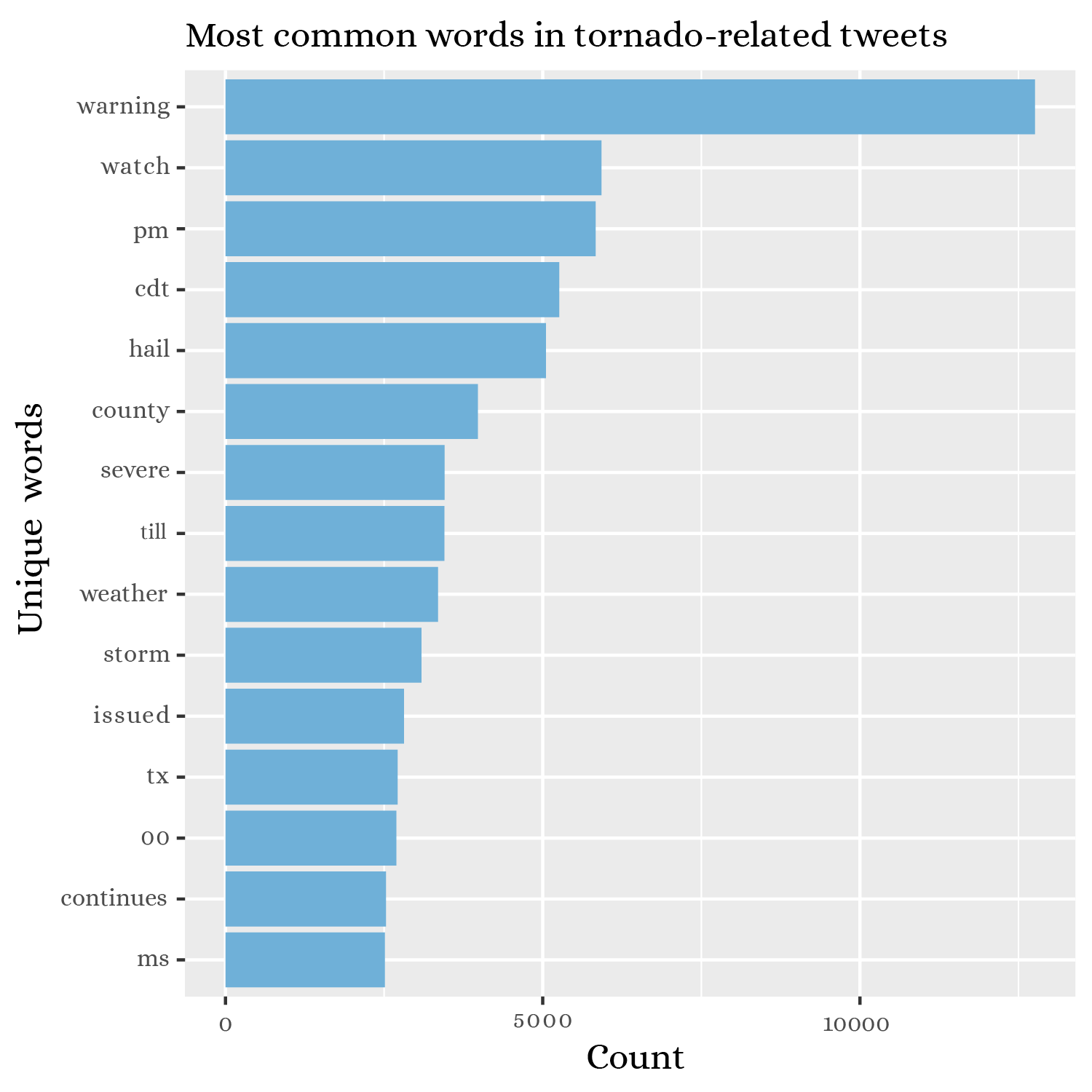
Figure 2. Recurring words in tweets about tornadoes.
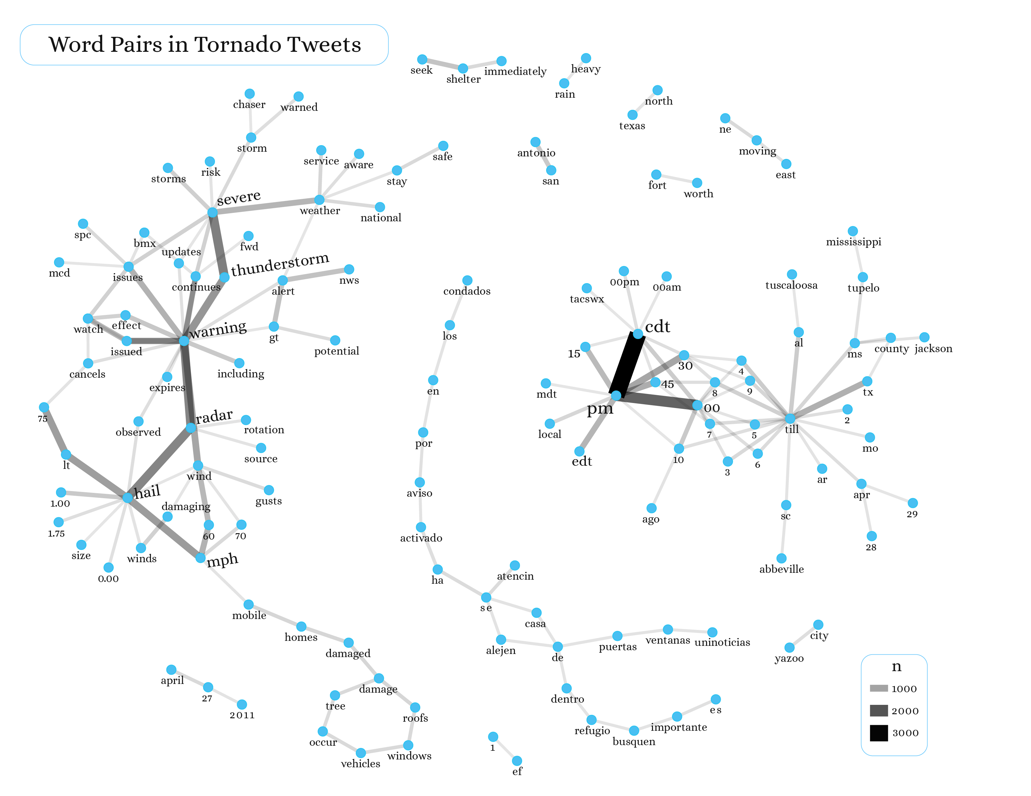
Figure 3. Network graph of frequently associated word pairs in tweets about tornadoes.
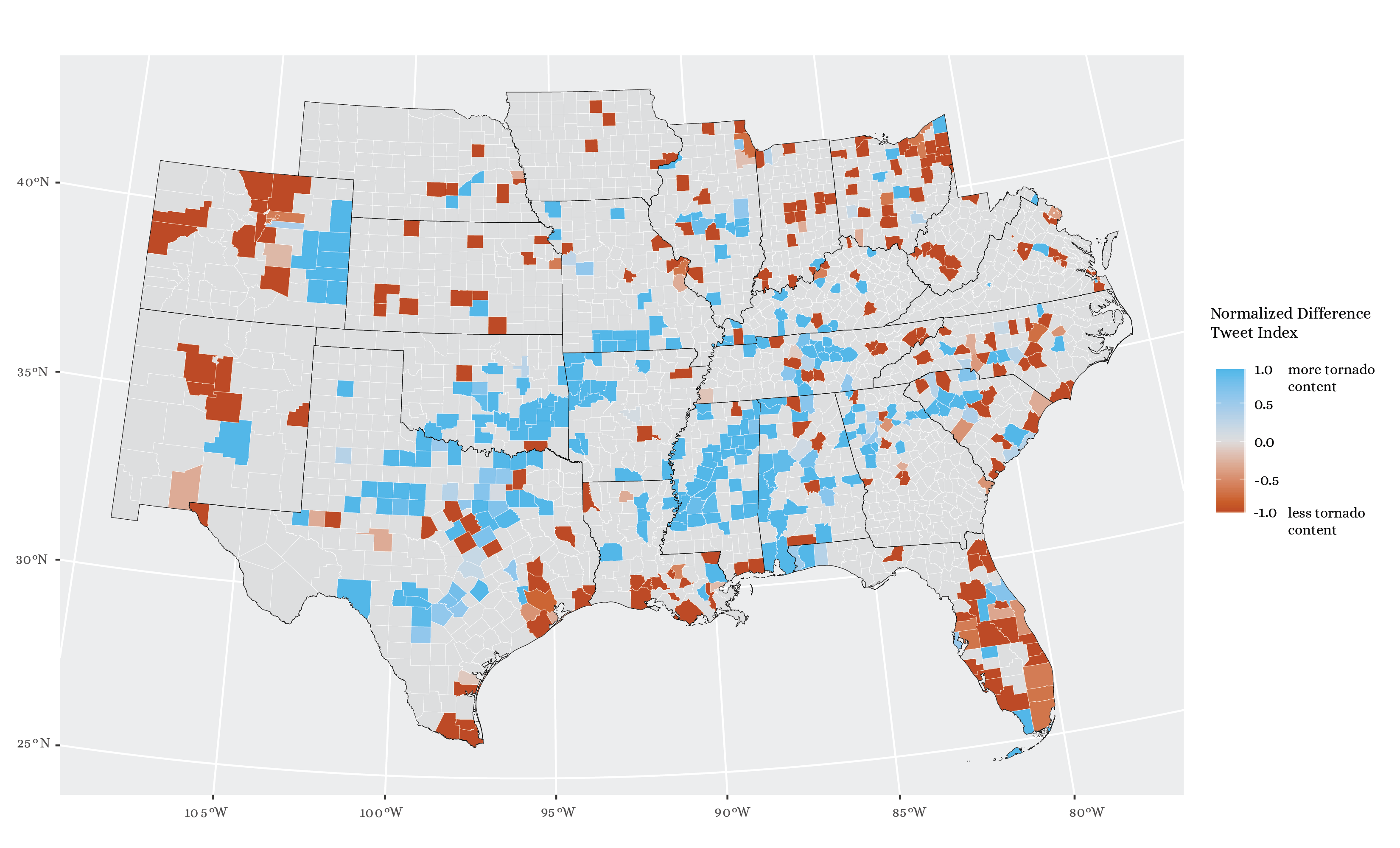
Figure 4. Map of the “Normalized Difference Tweet Index,” highlighting areas with more and less tornado-related content relative to baseline Twitter activity.
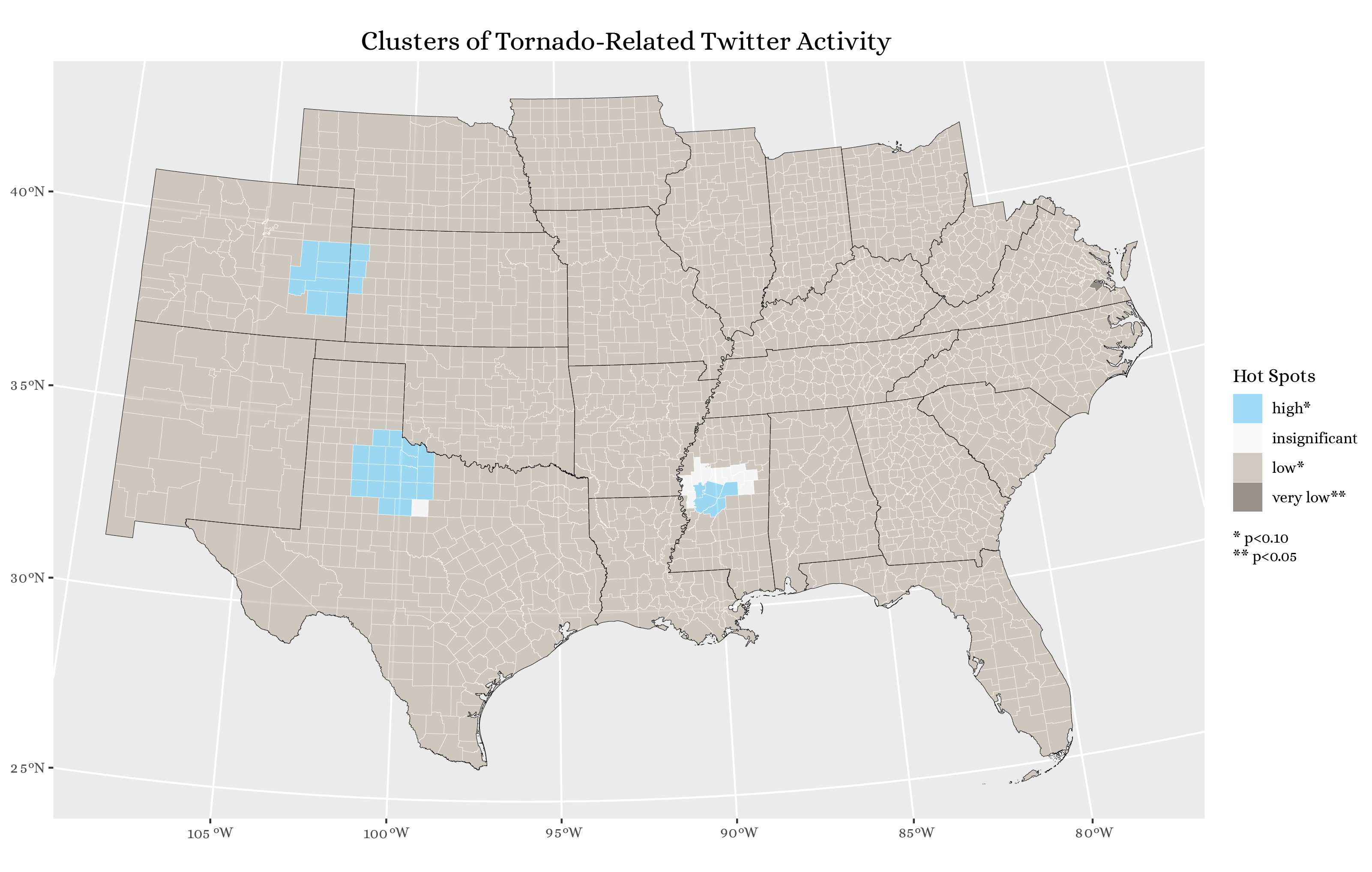
Figure 5. Statistically significant hotspots of tornado-related tweets, as identified by the Getis-Ord G* statistic.
Unplanned Deviations from the Protocol
There are some notable differences and uncertainties between the original study and my replication. The first major departure from the original study was the scale of analysis. Since the Twitter Search API is limited to the last 7-10 days, the ability to carry out any analysis is dependent on what is trending at a moment in time. Wang et al were able to obtain a large number of tweets in a relatively small area because the wildfires in Bernardo and San Marcos were major events, and generated a lot of local Twitter content. For my replication, I was constrained by the lower density of tornado-related tweets with attached geographic information, so I broadened the scope of my analysis to a region consisting of 23 states. Whereas Wang et al made KDE maps of density, it made more sense to produce choropleth maps in the replication.
By taking a different approach to the spatial dimension of the analysis, we were freed from some of the uncertainties involved in Wang et al, especially the uncertain parameters of their kernel density estimation. Replicating the temporal element of the study was straightforward, as was charting the most frequently recurring words. One other notable source of uncertainty is in the word-association methods: Wang et al applied k-means clustering to identify clusters of words that often appear together, whereas my replication used simple counts of the frequencies of word pairs. Since this replication is not attempting to reproduce the same results as Wang et al, however, the difference is not terribly important.
Some further uncertainty arises in the replication when we analyze tweet clustering using the Getis-Ord statistic. For starters, there is the method used to identify which counties are neighbors: taking centroids and using Euclidean distance above or below a threshold of 110 km. This introduces uncertainty because centroids are not perfectly representative of county shapes, and because counties vary in size and compactness. After calculating the G* score for each county, there is further uncertainty in what we consider a significantly low or high concentration of tornado-related tweets. As shown in Figure 5, nearly all counties have significantly low amounts of tweets, at the p < 0.10 level. Many of these counties are even ones that have fairly high NDTI values, as seen in Figure 4. This might reflect a bimodal or skewed distribution of Getis-Ord values, which could make the significance levels less meaningful since they are based on the assumption of a normal distribution of values. If most of the counties have scores well under the mean, then it does not make real sense to consider them statistically significant cold spots for tornado-related tweets.
Discussion
In this replication, I examined whether there were significant trends in the space, time, or content of tornado-related tweets between April 27 and May 4, 2021, and I found that there were indeed some significant spatial, temporal, and content-related patterns. Firstly, there were major spikes in Twitter activity between April 28-29, at about the time when a few tornadoes affected the Great Plains in TX, OK, and CO. Then there was a series of spikes in tornado tweets between May 2-4, when a rash of tornadoes descended on the South, especially in the region of MS, TN, and KY (Figure 1).
The content of tweets also exhibited interesting trends. For instance, the most common words were warning, watch, pm, and cdt (referring to Central Daylight Time), which points to a proliferation of tweets mentioning the specific times when tornado warnings were in effect (Figure 2). This pattern is borne out in a network graph of word pairs, where there is a whole section of hours and minutes (e.g. 2, 3, 4, 00, 30, 45) in Central Time (Figure 3). Other important topics in tornado tweets were wind speeds in miles per hour; other weather events taking place, like severe thunderstorms; damage done to mobile homes, trees, roofs, vehicles, and windows; similar subject matter in Spanish; and specific place names associated with the tornadoes. In the word network, which is filtered to include word pairs with ≥ 150 occurrences, mention is made of the following locations:
Yazoo City, MS
Abbeville, SC
Jackson County
Tupelo, MS
Tuscaloosa, AL
San Antonio, TX
Fort Worth, TX
North Texas
TX
MO
In a map of the NDTI statistic first put forth by Holler, we can see that there are stripes of high tornado-related Twitter activity running through Mississippi and from Texas northeast into Oklahoma and Arkansas (Figure 4). There are also areas with a lot of tornado content in eastern Colorado and northwestern South Carolina, where there were tornadoes on April 27th and May 3rd, respectively.
In the end, calculating the Getis-Ord statistic suggests that the most statistically significant hotspots of tornado tweets are the ones in eastern Colorado, north Texas, and the Central Valley of Mississippi (Figure 5). Thus, we have arrived at three different understandings of the spatial distribution of tornado-related tweets. The first came from the content of the tweets themselves, which name specific places, especially cities like Yazoo City and Tuscaloosa. Next came the normalized difference tweet index, which showed several swaths of tornado-related Twitter activity, often running from SW to NE beyond the trajectories of the tornadoes themselves, which generally covered only a few miles. The tweet index also revealed some scattered counties that saw more tornado tweets, like Hamilton County, NE, which experienced an EF-0 tornado on May 2nd, and Jefferson County, WV, which saw an EF-1 tornado on the 3rd (and consequently had the highest tweet index of any county in the state). The final approach, studying significant clusters using the G* statistic, tends not to capture such isolated counties; rather, it highlights three almost circular groups of counties with more tornado tweets.
Conclusion
One avenue for possible future research would be to compare the spatial distribution of tornado-related tweets with data on the actual locations of tornadoes, which are probably made available by the National Weather Service. For instance, the NWS provides raw daily reports of tornadoes in CSV format, with estimated lat/long coordinates and details on the tornados’ movements and damage (however, these tables also include delayed reports and unconfirmed information). The daily reports can be found at this link: https://www.spc.noaa.gov/climo/reports/today.html.
Given the stark difference between alternative ways of mapping tornado-related content (see Figures 4 and 5), it would be worth looking closely at the places where the maps do and do not agree.
Finally, we should pose the critical question – “So what? Why do we care?” Ultimately, we know where the tornadoes are taking place; what do Twitter data add to the conversation? At their core, these tweets are data on human behavior, because tweeting is a human behavior. Wang et al established that behavior varies with nearness to natural disasters – people react and tweet differently depending on where they are. Carrying this research forward, perhaps we ought to examine how people tweet about tornadoes differently in different places. Doing so might link this replication study to the existing theoretical literature on human behavior in the context of natural disasters.
References
Crawford, K., and M. Finn. 2014. The limits of crisis data: analytical and ethical challenges of using social and mobile data to understand disasters. GeoJournal 80 (4):491–502. DOI:10.1007/s10708-014-9597-z
Ord, J. K., and A. Getis. 1995. Local Spatial Autocorrelation Statistics: Distributional Issues and an Application. Geographical Analysis 27 (4):286–306. DOI:10.1111/j.1538-4632.1995.tb00912.x
Wang, Z., X. Ye, and M. H. Tsou. 2016. Spatial, temporal, and content analysis of Twitter for wildfire hazards. Natural Hazards 83 (1):523–540. DOI:10.1007/s11069-016-2329-6
Report Template References & License
This template was developed by Peter Kedron and Joseph Holler with funding support from HEGS-2049837. This template is an adaptation of the ReScience Article Template Developed by N.P Rougier, released under a GPL version 3 license and available here: https://github.com/ReScience/template. Copyright © Nicolas Rougier and coauthors. It also draws inspiration from the pre-registration protocol of the Open Science Framework and the replication studies of Camerer et al. (2016, 2018). See https://osf.io/pfdyw/ and https://osf.io/bzm54/
Camerer, C. F., A. Dreber, E. Forsell, T.-H. Ho, J. Huber, M. Johannesson, M. Kirchler, J. Almenberg, A. Altmejd, T. Chan, E. Heikensten, F. Holzmeister, T. Imai, S. Isaksson, G. Nave, T. Pfeiffer, M. Razen, and H. Wu. 2016. Evaluating replicability of laboratory experiments in economics. Science 351 (6280):1433–1436. https://www.sciencemag.org/lookup/doi/10.1126/science.aaf0918.
Camerer, C. F., A. Dreber, F. Holzmeister, T.-H. Ho, J. Huber, M. Johannesson, M. Kirchler, G. Nave, B. A. Nosek, T. Pfeiffer, A. Altmejd, N. Buttrick, T. Chan, Y. Chen, E. Forsell, A. Gampa, E. Heikensten, L. Hummer, T. Imai, S. Isaksson, D. Manfredi, J. Rose, E.-J. Wagenmakers, and H. Wu. 2018. Evaluating the replicability of social science experiments in Nature and Science between 2010 and 2015. Nature Human Behaviour 2 (9):637–644. http://www.nature.com/articles/s41562-018-0399-z.